Jump to content

Wikipedia:Featured picture candidates/June-2004

From Wikipedia, the free encyclopedia

Please cut and paste new entries to the bottom of this page, creating a new monthly archive (by closing date) when necessary.

Older Archive
Miscellaneous Archive
2004: January - February - March - April - May - June - July - August - September - October - November - December
2005: January - February - March - April - May - June - July - August - September - October - November - December
2006: January - February - March - April - May - June - July - August - September - October - November - December
2007: January - February - March - April - May - June - July - August - September - October - November - December
2008: January - February - March - April - May - June - July - August - September - October - November - December
2009: January - February - March - April - May - June - July - August - September - October - November - December
2010: January - February - March - April - May - June - July - August - September - October - November - December
2011: January - February - March - April - May - June - July - August - September - October - November - December
2012: January - February - March - April - May - June - July - August - September - October - November - December
2013: January - February - March - April - May - June - July - August - September - October - November - December
2014: January - February - March - April - May - June - July - August - September - October - November - December
2015: January - February - March - April - May - June - July - August - September - October - November - December
2016: January - February - March - April - May - June - July - August - September - October - November - December
2017: January - February - March - April - May - June - July - August - September - October - November - December
2018: January - February - March - April - May - June - July - August - September - October - November - December
2019: January - February - March - April - May - June - July - August - September - October - November - December
2020: January - February - March - April - May - June - July - August - September - October - November - December
2021: January - February - March - April - May - June - July - August - September - October - November - December
2022: January - February - March - April - May - June - July - August - September - October - November - December
2023: January - February - March - April - May - June - July - August - September - October - November - December
2024: January - February - March - April - May - June - July - August - September - October - November - December
Purge page cache if nominations haven't updated.


Bumblebee
Bumblebee &mdash

I like this photo a lot because it's perfectly in focus and gives an excellent view of the bumblebee anatomy (with the exception of the wings); someone familiar with the bumblebee body could add labels to it to describe the different parts, like in this drawing. The one gripe with it that I have is that the background color is a little too similar to the bumblebee body, maybe a PhotoShop expert could lighten the background up a little. Mark has uploaded a few more excellent photographs of his, by the way (hint, hint).--Eloquence* 04:53, May 10, 2004 (UTC)

  • Support - he nailed the focus and DOF - I've tried doing this kind of work, damn its hard - Gaz 13:04, 10 May 2004 (UTC)[reply]
  • Support. fabiform | talk 15:30, 10 May 2004 (UTC)[reply]
  • Support. Nice job of a difficult shot. --Andrew 00:28, May 11, 2004 (UTC)
  • Support. It's a fantastic photo, and it really compliments the article, showing the subject "doing its thing" (rather that all the "bumblebee sitting around doing nowt" photos I've taken). -- Finlay McWalter | Talk 00:49, 11 May 2004 (UTC)[reply]
  • Support. Good level of detail. - MykReeve 19:56, 11 May 2004 (UTC)[reply]
  • Support. Features very good to recognize -- Chris 73 | Talk 03:52, 12 May 2004 (UTC)[reply]
  • Support - MGM 09:25, May 12, 2004 (UTC)
  • Support, with one proviso. The photo is technically and aesthetically exceptionally good, except that it's a tad dark, so it loses detail. A few minutes work with Photoshop would cure the problem. I am in admiration of anyone who can do this very difficult photography - macros of insects that move around (including the waving of the flowers in the wind), or spook at the photographer's movement. It takes enormous patience to do good work, and a slight touchup of the image does not imply any weakness here (it's always better to aim for slight underexposure rather than risk ANY overexposure).Pollinator 17:43, 12 May 2004 (UTC)[reply]
  • Wow. Yes. -- Kaihsu 07:15, 2004 May 13 (UTC)
  • Support. Great close-up view. -Frazzydee 02:43, 22 May 2004 (UTC)[reply]
  • Support. - Bevo 16:44, 1 Jun 2004 (UTC)
  • +12 Promoted. - Bevo 16:44, 1 Jun 2004 (UTC)
Great Lakes from space
A dramatic image of the lakes that adds tremendously to the article. Uploaded by Minesweeper.

JnB987 17:51, 16 May 2004 (UTC) (Article is Great Lakes --Andrew 01:35, May 17, 2004 (UTC))[reply]

  • Object on copyright grounds. Quoting Wikipedia:Featured pictures, "Images listed here should be either in the public domain or covered by the GNU Free Documentation License." An exception is made for fair use; none is made for non-commercial use only, which is the status of this picture. That said, NASA's Astronaut Photography of Earth is likely to have a good picture that is in the public domain. --Andrew 01:35, May 17, 2004 (UTC)
  • Object on licence grounds. -- Finlay McWalter | Talk 19:06, 17 May 2004 (UTC)[reply]
  • Object on licence grounds. - Gaz 12:35, 19 May 2004 (UTC)[reply]
  • +1 -3 Not promoted. - Bevo 19:13, 1 Jun 2004 (UTC)


Paris from Notre-Dame
I'm self-nominating this image, which shows a view over the city of Paris from Notre-Dame. I think it's nicely composed with one of the cathedral's famous gargoyles to the left, the River Seine below, and the Eiffel Tower in the distance. - MykReeve 20:07, 11 May 2004 (UTC)[reply]
Observing a solar eclipse
Self nomination from Ævar Arnfjörð Bjarmason, a picture i took of people observing a Solar eclipse in Iceland in the year 2002, i think it captures the subject quite well, beautiful colors (the sun is just amazing) and people gathering to stare at the sun.
  • Support, --Ævar Arnfjörð Bjarmason 11:17, 2004 May 21 (UTC)
  • Oppose, I see a group of people observing the sun. I don't see an eclipse. Ericd 21:09, 21 May 2004 (UTC)[reply]
    • Due to a cloudcover in between the eclipse and the observers the halo of the sun illuminated the clouds in this way causing the lighting effect, which is the reason such a big area is illuminated as opposed to just the burning halo of the sun during the eclipse. --Ævar Arnfjörð Bjarmason 21:49, 2004 May 21 (UTC)
  • Oppose. It's a nice photo, but I don't think it's "feature quality". Nice dog, however. -- Finlay McWalter | Talk 22:49, 21 May 2004 (UTC)[reply]
    • Too bad the poor thing had no eye protection and is now blind as a bat. →Raul654 22:54, May 21, 2004 (UTC)
  • Oppose - Does not "add significantly" to the article, and technically is not "briliant". Sorry. - Gaz 23:58, 21 May 2004 (UTC)[reply]
  • Oppose. same reasons as McWalter and Gaz. -Frazzydee 02:37, 22 May 2004 (UTC)[reply]
  • Oppose. It's a nice photo, but it doesn't really reflect what I'd expect to see in an eclipse photo. Angela. 18:22, 3 Jun 2004 (UTC)
  • Oppose. It's just a big, bright, fireball; which is what the sun looks like all the time. Mike Storm 01:58, 4 Jun 2004 (UTC)
  • Oppose. Point and click, poor exposure (and timing?)--[[User:HamYoyo|HamYoyo (Talk)]] 17:41, Jun 4, 2004 (UTC)
  • Not promoted. +1 -7 - Bevo 22:51, 8 Jun 2004 (UTC)
(1, 2, 3, 4,

5, 6)

Four-stroke cycle
Created by User:Wapcaplet for four-stroke cycle. These are excellent illustrations. - Fredrik 10:40, 21 May 2004 (UTC)[reply]
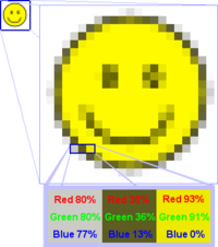
Rgb-raster-image.png
I like this picture because it's fun to look at and does a good job of illustrating one of the problems with raster graphics. ☞spencer195 05:24, 20 May 2004 (UTC)[reply]

It's from the article raster graphics and the caption on the photo was

Suppose the smiley face in the top left corner is an RGB bitmap image. When zoomed in, it might look like the big smiley face to the right. Every square represents a pixel. Zoomed in further we see three pixels whose colors are constructed by adding the values for red, green and blue.
  • Oppose. The "balance" of the constituents is off-center. Also I'd prefer other colors to be used in the text boxes at the bottom. It tells a good story. I'd just like a more pleasing image. - Bevo 18:50, 21 May 2004 (UTC)[reply]
  • Abstain, for now. The colours of the text-boxes correspond with the three pixels they describe, so I think that's a good thing. I'd support the image, but some of the text (the percentage symbols) is mis-clipped. If that could be fixed, I'd support. And (as usual) I wish the image page were wikified, had the appropriate rights boilerplate message, and the source file (if one exists) were attached as a zip. -- Finlay McWalter | Talk 22:55, 21 May 2004 (UTC)[reply]
  • Oppose. Photographic image could have been used, as this is what the article states raster graphics are most appropriate for. Any one who has ever messed around with MS Paint will have noticed this anyway.--[[User:HamYoyo|HamYoyo (Talk)]] 17:55, Jun 4, 2004 (UTC)
  • Support. For the information it provides. I just wonder why I keep getting a feeling that there is a tilt in the image? --Ankur 05:53, 8 Jun 2004 (UTC)
  • Not promoted +2 -2 abstentions Denni 04:47, 2004 Jun 11 (UTC)
Image:Pinochetjunta.jpg
I like this image quite alot, and of course it ads a good deal to Military dictatorship. The smarmyness of it all, and the almost surreal and unbelievable pomposity.. It just seems to sum up banana republic in a way I can't imagine being improved upon. Sam [Spade] 12:13, 19 May 2004 (UTC)[reply]
  • Oppose - I understand why Sam likes this image, but it fails to make it even half way on my personal "brilliance meter" (PS: Sam, please provide a link to the article in your nomination blurb) - Gaz 12:32, 19 May 2004 (UTC)[reply]
  • Oppose (for now). Actually I really like the picture (it's got lots of character) and I do think it helps the article a lot. But the image's contention to be "public domain" isn't supported by a link to the source or other information. Secondarily, I wish the image page were wikified, including the source, date information (the article says 1973, if that's true then so should the image page), names of those shown (not just Pinochet), and the appropriate PD msg tag. -- Finlay McWalter | Talk 14:25, 19 May 2004 (UTC)[reply]
  • Oppose - Because claim to be PD without source. But I love it ! -- Ericd 21:36, 19 May 2004 (UTC)[reply]
  • Oppose. I only support pictures created by Wikipedians. Kingturtle 19:57, 22 May 2004 (UTC)[reply]
  • Photo Associated Press. I believe, see http://web.elsatnet.cz/panek/web/obr/clanky/Pinochet.jpg
    • Now listed as possible copyvio. --Zigger 21:28, 2004 May 28 (UTC)
  • Not promoted +0 -4 also copyvio Denni 04:47, 2004 Jun 11 (UTC)

[[Media::Jimmycarter_rabbit.jpg|Jimmy Carter and Swamp Rabbit]]

[edit]
Jimmy Carter and Swamp Rabbit
It's not a particularly great photo, but I think the subject matter is. I'm new here, but trying to be bold, so forgive me if I'm fuzzy on some of the established conventions... For an article I wrote on the Swamp Rabbit I cropped an image provided courtesy of the Jimmy Carter Library, reduced the size, and increased the contrast and saturation. Self-nomination. - Erik 18:19, 18 May 2004 (UTC)[reply]
  • Oppose - I fail to see how this image "adds significantly" to the article. - Gaz 12:26, 19 May 2004 (UTC)[reply]
    • You're probably right, but if there wasn't some sort of historical context, I think some people might think I had completely fabricated the existence of swamp rabbits for my own sinister reasons...
      • I agree. Without the image, I'd be highly skeptical that such a creature existed; I'd put it with the snow snakes and jackalopes. --Andrew 21:54, May 19, 2004 (UTC)
  • Support &mdash It's the kind of photo-op that results in a picture that tells a story in spite of it's lack of photo quality. Maybe it could also add significantly to the Jimmy Carter article. &mdash Bevo 15:08, 19 May 2004 (UTC)[reply]
  • Support - its utility to the article counterbalances its low photographic quality. --Andrew 21:54, May 19, 2004 (UTC)
  • Oppose. It's not really eye catching, and it doesn't really add anything significant to the article. →Raul654 18:36, May 21, 2004 (UTC)
  • Oppose. You can't even tell it is him. Furthermore, we should feature pictures created by wikipedias, not photos taken from other people. we are not the Pulitzer prizes. Kingturtle 19:58, 22 May 2004 (UTC)[reply]
  • Oppose.--[[User:HamYoyo|HamYoyo (Talk)]] 17:57, Jun 4, 2004 (UTC)
  • Not promoted +2 -4 Denni 04:47, 2004 Jun 11 (UTC)
Circlestrafing
Okay, this is incredibly cheap (less than five minutes of work), but I'm listing it by the criterion of "adding significantly to the article" because I feel that it does a perfect job of illustrating the topic in question. Self-nomination. - Fredrik 18:08, 17 May 2004 (UTC)[reply]
Note: image has been updated per suggestions by Finlay McWalter. Fredrik 21:04, 17 May 2004 (UTC)[reply]
  • Support (in its new, sickeningly violent, incarnation). Assuming you made this with some structured drawing program, could you upload a zip of the draw file and link to it from the :image: page? -- Finlay McWalter | Talk 21:36, 17 May 2004 (UTC)[reply]
    • I'm afraid I didn't. I've recently started checking out vector drawing, but I'm not quite comfortable with it yet so this was made with traditional methods. Fredrik 21:46, 17 May 2004 (UTC)[reply]
  • Support, nice, and nice article --Ævar Arnfjörð Bjarmason 11:18, 2004 May 18 (UTC)
  • Support (on balance) - Scores very well on the "adds significantly" side, only just scrapes in on the "brilliant" part. - Gaz 12:38, 19 May 2004 (UTC)[reply]
  • Support. Oppose &mdash I don't find that it illustrates the concept in the best way possible. At first I thought it was a picture of several distinct blue-man shooters. The illustration of movement of a single blue-man is poorly conveyed (the latest graying helped a little, but why not gray them all out but the last, and let the length of the projectile path convey the timing?) - Bevo 14:51, 19 May 2004 (UTC)[reply]
  • Oppose this one. It doesn't really inform the viewer of the logistics of why the blue player will prevail. Could've used some mathimatical reasoning. Article was nice and esoteric though.--[[User:HamYoyo|HamYoyo (Talk)]] 18:01, Jun 4, 2004 (UTC)
    • Mathematical reasoning? - Fredrik (talk) 22:37, 4 Jun 2004 (UTC)
      • I don't think it has to with mathmatical reasoning. It has to do with object tracking. The blue controls his motion and can correct his aim to match his motion. Red doesn't know the orbital velocity and the increase/decrease in orbiting distance (thus changing the speed) so red has to anticipate blues motion for each shot he makes. Blue only has to anticipate his own motion. What is intresting is double circlestrafing. RobKohr
  • Promoted +4 -1 Denni 04:47, 2004 Jun 11 (UTC)
Peacock displaying
I just ran across this today. It's amazing. I was floored when I saw it wasn't already featured. →Raul654 17:18, May 13, 2004 (UTC)
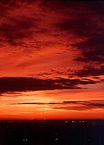
Red sky at night
These images by User:Dwindrim are wonderful illustrations for Weather lore, and I think they're well worth featuring. Honestly, I like all the pictures he's put on that page, both as pictures and for their excellent depiction of weather patterns. - Jwrosenzweig 17:51, 12 May 2004 (UTC)[reply]
  • Not sure what to do with this: there are two pictures here. Perhaps they should be nominated separately (as with the villain ad the mad scientist) or perhaps we have an embarrassment of riches? All the pictures on the page are really good, which should't bar their inclusion. I suggest choosing a single picture from the page and voting on it as a representative of the whole pageful of images. This could be indicated on the featured pictures page. --Andrew 19:56, May 12, 2004 (UTC)
    • I suggest the opposite, that the entire page be nominated and voted on as one. I support enthusiastically, BTW. Hello new wallpaper! Sam Spade 23:08, 12 May 2004 (UTC)|}[reply]
      • I certainly apologize if I nominated incorrectly -- haven't used this page before! If it needs to be split in two, please let me know (or boldly do it yourself, though of course I hate to make work for anyone else). And I do like all the pictures on that page (hey Sam, we agree on something! :-) but a number of them are still very small (large images not yet uploaded) and so I'm not sure about nominating them, as the detail is hard to see. But I definitely think large versions of all of them would be excellent pictures to feature. I chose these two as the best candidates because of their exceptional beauty and because full sizes were available. Jwrosenzweig 23:58, 12 May 2004 (UTC)[reply]
  • Oppose. Fair use and non-com images are, I think, a necessary evil, but I think featured pictures shouldn't compromise (I'm perfectly happy with GFDL, GPL, PD, CC, BSD licences). As a secondary issue, the images are a bit small, and the image pages aren't wikified. -- Finlay McWalter | Talk 20:18, 13 May 2004 (UTC)[reply]
    • This picture is (now?) licensed under a Creative Commons license and has a high-resolution version. As for the pictures that have not been nominated, I think they need to be voted on separately. --Andrew 01:41, May 17, 2004 (UTC)
  • Support. The picture is beautiful. --Andrew 01:41, May 17, 2004 (UTC)
  • Support ✏ Sverdrup 20:55, 17 May 2004 (UTC)[reply]
  • Support. Picture adds to the article, and is very pleasing to the eye. Good job. -Frazzydee 02:40, 22 May 2004 (UTC)[reply]
  • Support, but would prefer it was larger. Angela. 18:22, 3 Jun 2004 (UTC)
  • Promoted +6 -0 Denni 04:47, 2004 Jun 11 (UTC)
Mackerel sky
Split from above. Each image should go through its own voting process. If we get an embarassment of riches from a user then we will deal with that as a separate issue (ie perhaps an honourable mention and a link to a gallery they create) - Gaz 11:55, 13 May 2004 (UTC)[reply]
  • My apologies to Gaz for making him split the photo vote -- I'll be more careful next time. Just wanted to make sure my vote was counted for both these fine photos. Jwrosenzweig 16:26, 13 May 2004 (UTC)[reply]
    • This is not a problem. I lurk here and am pleased to tidy up where needed. - Gaz
  • My vote BTW is "can we see a larger version" (=neutral) - Gaz 16:59, 13 May 2004 (UTC)[reply]
  • Oppose. Fair use and non-com images are, I think, a necessary evil, but I think featured pictures shouldn't compromise (I'm perfectly happy with GFDL, GPL, PD, CC, BSD licences). As a secondary issue, the images are a bit small, and the image pages aren't wikified. -- Finlay McWalter | Talk 20:19, 13 May 2004 (UTC)[reply]
    • This picture is (now?) licensed under a Creative Commons license and has a high-resolution version. As for the pictures that have not been nominated, I think they need to be voted on separately. --Andrew 01:44, May 17, 2004 (UTC)
  • Support. Also an excellent picture. I think we already have an embarrassment of riches - quite frankly, all the pictures on the weather lore page are excellent; my only objection to voting to feature them en masse is that they haven't all been uploaded in large free-license form. --Andrew 01:44, May 17, 2004 (UTC)
  • Beautiful, support. - user:zanimum
  • Support. Angela. 18:22, 3 Jun 2004 (UTC)
  • Support. --Ankur 05:53, 8 Jun 2004 (UTC)
  • Support Sam [Spade] 05:48, 10 Jun 2004 (UTC)
  • Promoted +7 -0 Denni 04:47, 2004 Jun 11 (UTC)


[[Media:Troms%F8.jpg|Picture of Tromsø from Fløya]]

[edit]
[[Image:Troms%F8.jpg|thumb|left|400px|Picture of Tromsø from Fløya]]
A nice panoramic view of the Tromsø Island seen from the mainland. The mountains at the outer islands present an astonishing border of snow and ice around the urban community in the middle of the arctic at 70 degree latitude.


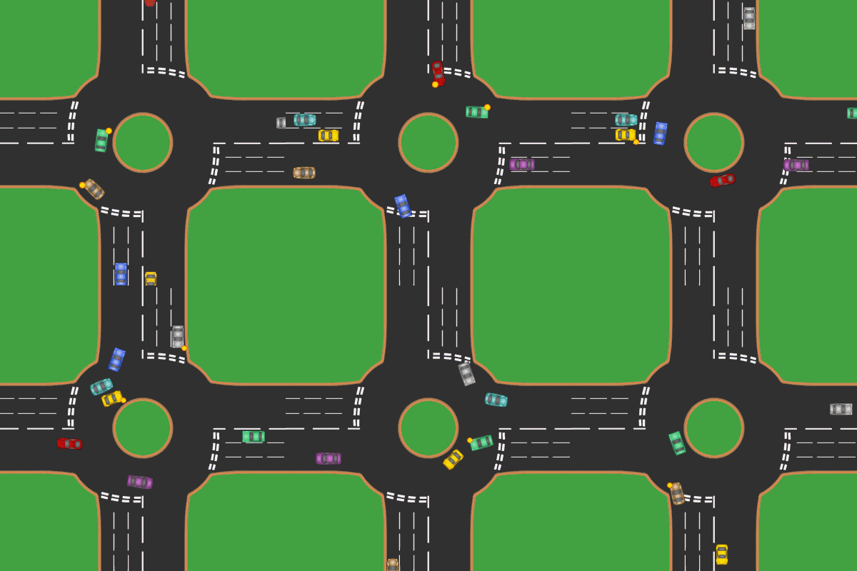
A UK Roundabout
Accompanies article Roundabout. This simple animated gif packs the most information into the simplest presentation I can recently recall. As a bonus, every single vehicle signals! Moreover, something quite impossible for a paper encyclopedia. (BTW, this train wreck of an image - obviously - does not work correctly as a thumbnail. See the original for the way it should.) Denni 00:47, 31 May 2004 (UTC)[reply]

Yes the gif is my original work. Hi. I'm no artist, so I'm sorry that it doesn't look that pretty. I was trying to squeeze all the neccesary information into the gif, and replace the previous animation which didn't show cars yeilding. I would be happy if someone wants to make it more aesthetically pleasing, as long at it shows as much information as my gif. Mintguy (T) 10:23, 12 Jun 2004 (UTC)

  • Support. Angela. 18:22, 3 Jun 2004 (UTC)
  • Support. Definitly catches the look-and-feel of the Highway Code. -- DrBob 18:28, 3 Jun 2004 (UTC)
  • Maybe I'm not seeing this right, but it appears that all the cars leave tracks and by the end, the whole picture is a mess. Am I the only one seeing that? →Raul654 18:38, Jun 3, 2004 (UTC)
    • there is a bug in mediawiki's thumbnailer for animated GIFs which produces this effect. Look at the article (which has the unthumbnailed version) and all should be well. -- Finlay McWalter | Talk 18:42, 3 Jun 2004 (UTC)
  • Support. It's perfect - all the signals are correct, all the possible cases are shown, Mintguy even correctly models the unwise (too trusting) entry of Jason-in-his-Astra (yellow). -- Finlay McWalter | Talk 18:47, 3 Jun 2004 (UTC)
  • Support, but why not provide a mirrored version also? Unfortunately it is impossible for me to follow this one since it contradicts any sense of spatial intuition I have developed over the last several years ;) - Fredrik (talk) 18:51, 3 Jun 2004 (UTC)
    • (comment) I suspect if you asked Mintguy he would do one. But there are (at least) two strategies used for RH roundabouts. In Massachusetts I believe traffic on the roundabout yields, in other places it's those joining. And the lane discipline and signalling rules presented here are UK specific also, so I don't know how they'd translate to other jurisdictions. -- Finlay McWalter | Talk 19:09, 3 Jun 2004 (UTC)
    • (comment) I've done a quick flip of the image at Image:UK Roundabout 8 Cars flipped.gif. Is this applicable to RHD countries? James F. (talk) 13:51, 10 Jun 2004 (UTC)
  • Oppose, please do not mind, while the image is informational it lacks in aesthetics. --Ankur 05:53, 8 Jun 2004 (UTC)
  • Oppose. Lacks aesthetic appeal and also I'm British so of little interest. Was intrigued when I saw the chaotic thumbnail!--[[User:HamYoyo|HamYoyo (Talk)]] 17:36, Jun 4, 2004 (UTC)
  • Oppose until some kind of attribution is given. —LarryGilbert 22:11, 2004 Jun 4 (UTC)
    • Did User:Mintguy actually create this image? As you point out, there is no copyright information accompanying this image. - Bevo 16:07, 10 Jun 2004 (UTC)
      • I'm pretty sure he did (as I think I remember some intermediate versions being bickered over). I've left a message on Mintguy's talk page asking for info and attributions - but Mintguy appears to be on wikiholiday (no contribs for 2 weeks) so we may not get a response in time. -- Finlay McWalter | Talk 17:06, 10 Jun 2004 (UTC)
        • We can be patient and wait for the answer. - Bevo 21:06, 10 Jun 2004 (UTC)
          • The attribution concern is now resolved. User:Mintguy is the creator and has granted explicit permission for use. - Bevo 19:37, 12 Jun 2004 (UTC)
  • Support, shows alot of information. Lorax 21:52, Jun 5, 2004 (UTC)
  • Support. James F. (talk) 13:36, 10 Jun 2004 (UTC)
  • Support. Oppose until some kind of attribution is given. - Bevo 16:07, 10 Jun 2004 (UTC)
  • Support. I had to think on this one a bit. While it does not look that pretty, it _does_ show a lot of information. However, it would be excellent if some work was done on this, in order to make the images less flat, and _slightly_ more realistic. -Frazzydee 20:25, 10 Jun 2004 (UTC)
  • I might give redrawing this animation to make it look a bit better a try. I'll see if I have time tomorrow or on Saturday. Fredrik (talk) 21:13, 10 Jun 2004 (UTC)
    • Let us just wait and give it some time - we are not in a hurry. I'd love to support a better verion. --Ankur 21:25, 10 Jun 2004 (UTC) Support, Nice Job. --Ankur 19:28, 12 Jun 2004 (UTC)
  • Updated. Will need a little more work, though. Fredrik (talk) 18:56, 12 Jun 2004 (UTC)
  • I'll support the updated version, it looks a lot better. ✏ Sverdrup 19:58, 12 Jun 2004 (UTC)
  • I love the updated version. So I of course support it. Mintguy (T) 17:49, 13 Jun 2004 (UTC)
  • Support. I did not like the previous "blinking boxes" version, but it looks great with rendered cars. PlatinumX 07:16, 14 Jun 2004 (UTC)
  • Promoted: 13 ayes, 2 (out-dated) nays. James F. (talk) 13:19, 18 Jun 2004 (UTC)
Painter's algorithm
Illustration for painter's algorithm. Early crappy attempt at vector drawing from me, but I'm giving this nomination a shot anyway. Fredrik 15:21, 30 May 2004 (UTC)[reply]
  • Support. Simple and effective, as illustrations should be. Denni 18:20, 1 Jun 2004 (UTC)
  • Support. Great poster appeal too! Love the shades of colour on the trees.--[[User:HamYoyo|HamYoyo (Talk)]] 17:33, Jun 4, 2004 (UTC)
  • Supoort. James F. (talk) 13:36, 10 Jun 2004 (UTC)
  • Support. - Bevo 02:24, 13 Jun 2004 (UTC)
  • Promoted +5 -0 - Bevo 02:57, 22 Jun 2004 (UTC)


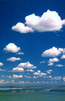
cumulus humilis
Self-nomination. Goes with Weather lore. What I consider to be the best weather-related picture I've ever taken. Denni 03:32, 1 Jun 2004 (UTC)
  • Support! But you really ought to shoot these great weather pictures at a much higher resolution... Fredrik (talk) 18:31, 1 Jun 2004 (UTC)
  • I would support if it was at least 300px in width. Angela. 18:22, 3 Jun 2004 (UTC)
    • It's 288px in width. Does 12px really do that much? :) - Fredrik (talk) 18:54, 3 Jun 2004 (UTC)
      • I changed my mind. I was thinking that for Pic of the day it had to be 300px, but not all them are, so it doesn't matter. Support. Angela. 02:20, 4 Jun 2004 (UTC)
  • Support. ✏ Sverdrup 08:54, 4 Jun 2004 (UTC)
  • Support. Now I know a cumulis humilis when I see one.--[[User:HamYoyo|HamYoyo (Talk)]] 17:31, Jun 4, 2004 (UTC)
  • Support. Nicely done. Lorax 22:02, Jun 5, 2004 (UTC)
  • Support. - Bevo 13:11, 10 Jun 2004 (UTC)
  • Support - MykReeve 23:41, 12 Jun 2004 (UTC)
  • Wow, that's really nice. Support. blankfaze | •­• 23:56, 15 Jun 2004 (UTC)
  • Promoted +9 -0 - Bevo 03:40, 22 Jun 2004 (UTC)


County Hall
This is a photograph taken by me of County Hall in London. I think it came out quite flukily well. Morwen 22:07, 9 Jun 2004 (UTC)
  • (comment) it's a bit wee. I don't suppose you have a larger version you could upload? And I think some subtle photoshoppery (particularly upping the saturation a bit, to "de-britify" the weather) is in order. -- Finlay McWalter | Talk 11:54, 10 Jun 2004 (UTC)
  • Support - MykReeve 23:41, 12 Jun 2004 (UTC)
  • A bit small, but support anyway. Angela. 02:02, 20 Jun 2004 (UTC)
  • Oppose. Just is not up to the minimum Featured picture standards. - Bevo 04:21, 22 Jun 2004 (UTC)
  • Support if there is a larger version siroχo 05:26, Jun 24, 2004 (UTC)
  • Not promoted +3 -1 2N - Bevo 11:04, 25 Jun 2004 (UTC)
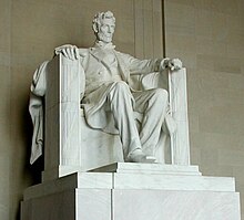
Lincoln statue.jpg
Self-nom. I took this one, and I really like it. It's a high resolution pic, and I think it adds significantly to both Lincoln Memorial and Abraham Lincoln. →Raul654 19:40, Jun 12, 2004 (UTC)
  • Support. The attribution text with the image just says "taken by me". Could that be editted to indicate the ID intead of just "me"? - Bevo 20:12, 12 Jun 2004 (UTC)
    • Done. →Raul654 20:13, Jun 12, 2004 (UTC) ... Thx! - Bevo 20:15, 12 Jun 2004 (UTC)
  • Support, nicely framed and illustrative - MykReeve 23:41, 12 Jun 2004 (UTC)
  • Oppose. Again, it just is not a strong enough photograph. Poke around the net and you'll see much better photographs of Lincolns' statue, for example Ben's Guide. There are thousands of photographs of the Lincoln statue, some are world famous, so standards are high. — NickP 12:20, Jun 13, 2004 (UTC)
    • I have some very bad news for you, but of the 4 statue pictures at the site you mentioend, 2 of them have very obvious jpeg artifacts, and the other two show nothing more than the head. →Raul654 22:24, Jun 13, 2004 (UTC)
  • Support. That's exactly what it looks like from a pedestrian's POV. - Bevo 04:18, 22 Jun 2004 (UTC)
  • Support. James F. (talk) 01:10, 28 Jun 2004 (UTC)
  • Promoted +5 -1 - Bevo 22:27, 28 Jun 2004 (UTC)


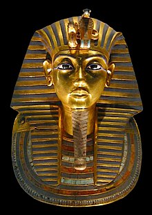
Tutankhamun-mask.jpg
Tutankhamun-mask-retouched.jpg
Self-nomination. A nice, bright, large image of the funerary mask of Tutankhamun in the Egyptian Museum in Cairo. - MykReeve 00:07, 13 Jun 2004 (UTC)
  • Oppose. The picture quality is technically poor—not very sharp and is actually a little dark. To be elected, images really need to be spectacular!NickP 12:01, Jun 13, 2004 (UTC)
  • Support. I find it a very natural presentation of the subject, with the lighting contributing to highlighting the facial portions of the mask. Anyone could use software to arrange a different lighting for that image, but I'd predict a less pleasing image would result. - Bevo 20:19, 13 Jun 2004 (UTC)
  • Nuetral I think the lighting is fine, but it needs to be sharpened a little. Lorax 01:42, Jun 14, 2004 (UTC)
  • support. Badanedwa 03:02, Jun 16, 2004 (UTC)
  • Neutral. Needs to be sharper, but otherwise a very nice picture that really helps the article. PlatinumX 00:19, 21 Jun 2004 (UTC)
  • Oppose. I saw this exhibit a week or so ago. The lighting is from the small lights in the display case itself and there are plenty of better pictures than this of the mask as the glass casing hinders the quality of the image.--[[User:HamYoyo|HamYoyo (Talk)]] 18:30, Jun 23, 2004 (UTC)
    • Can you provide those better pictures of this subject to the Wikipedia collection? - Bevo 23:03, 23 Jun 2004 (UTC)
      • I'm afraid they're the likes of what is found on postcards and in guidebooks - not public domain. This pic is fine for wikipedia, I just don't know if it's featured picture standard.--[[User:HamYoyo|HamYoyo (Talk)]] 09:20, Jun 27, 2004 (UTC)
    • It is quite conceivably the glass case around the mask that reduces the image quality here. If someone else is prepared to apply a sharpening filter to the image, I'd support that but I confess that I dislike applying filters which alter image content. - MykReeve 00:18, 24 Jun 2004 (UTC)
  • I put up a retouched version at Image:Tutankhamun-mask-retouched.jpg. I removed a few light spots from the face, added artificial light to the darker areas, removed objects in the background, and tweaked the overall brightness level slightly. I won't advocate that this modified version should be used instead of the real live photo, but I'm providing it as an alternative. Fredrik | talk 00:59, 24 Jun 2004 (UTC)
  • Not promoted +3 -2 2N - Bevo 16:44, 29 Jun 2004 (UTC)
Queenstown
Needs to be removed from FP because of no article association, as well as no copyright status information. - Bevo 19:59, 4 Jun 2004 (UTC)
  • It's used on Queenstown, New Zealand. "The following pages link to this image" is broken as of MediaWiki 1.3, so beware of deleting apparently unlinked images. -- DrBob 20:03, 4 Jun 2004 (UTC)
    • Thanks for the information about the article association. I've placed a note on the image itself. A note on VillagePump disclosed a workaround that doing an edit on a page that's not showing up in an image's list of linked articles will allow it to show. - Bevo 19:26, 5 Jun 2004 (UTC)
  Many, if not all, pre-1.3 image pages have this problem.
  SourceForge bug #963763, being worked on presently.
  (Bug #966936 points out that editing, then re-saving
  the page, is a work-around.) 
  Niteowlneils 19:06, 5 Jun 2004 (UTC)
  • Now if we could get the copyright status clarified? - Bevo 20:16, 4 Jun 2004 (UTC)
  • Hm, a little blurry.Enochlau 11:28, 26 Jun 2004 (UTC)
  • I took the picture and uploaded it. It may not be brilliant but it conveys the remarkableness of the Remarkables range Tiles 07:44, 30 Jun 2004 (UTC)
  • archived and retained now that copyright status is known - Bevo 15:14, 30 Jun 2004 (UTC)